Monday, April 4, 2016

My Favorite Logos

1) My personal favoite logo of a company I know has to be the microsoft windows logo. The design of the logo is nice beacuse it appears as a window frame in many colors that instantly catches the eye. What I like most about seeing this logo is knowing that my computer is actually working and isnt running in to any issues. 2) 
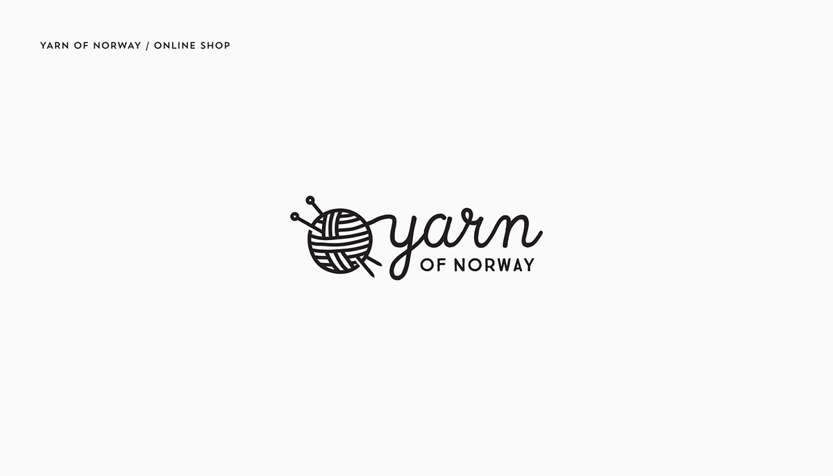
I love how the yarn perfectly flows into the brand itself 
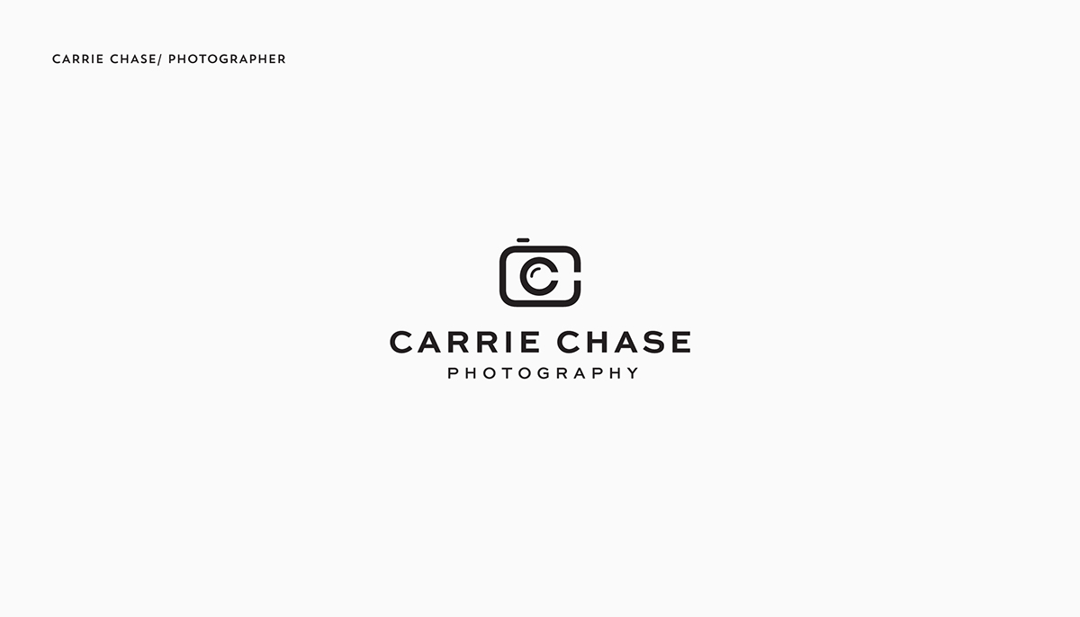
The name being shaped to appear as a camera gives this logo a clever and memorable look Its a very self explanitory logo and I enjoy that, at the same time it has a very bizarre look This logo is a very nice mix of a phone and a book creative a very modern and self explanitory logo 
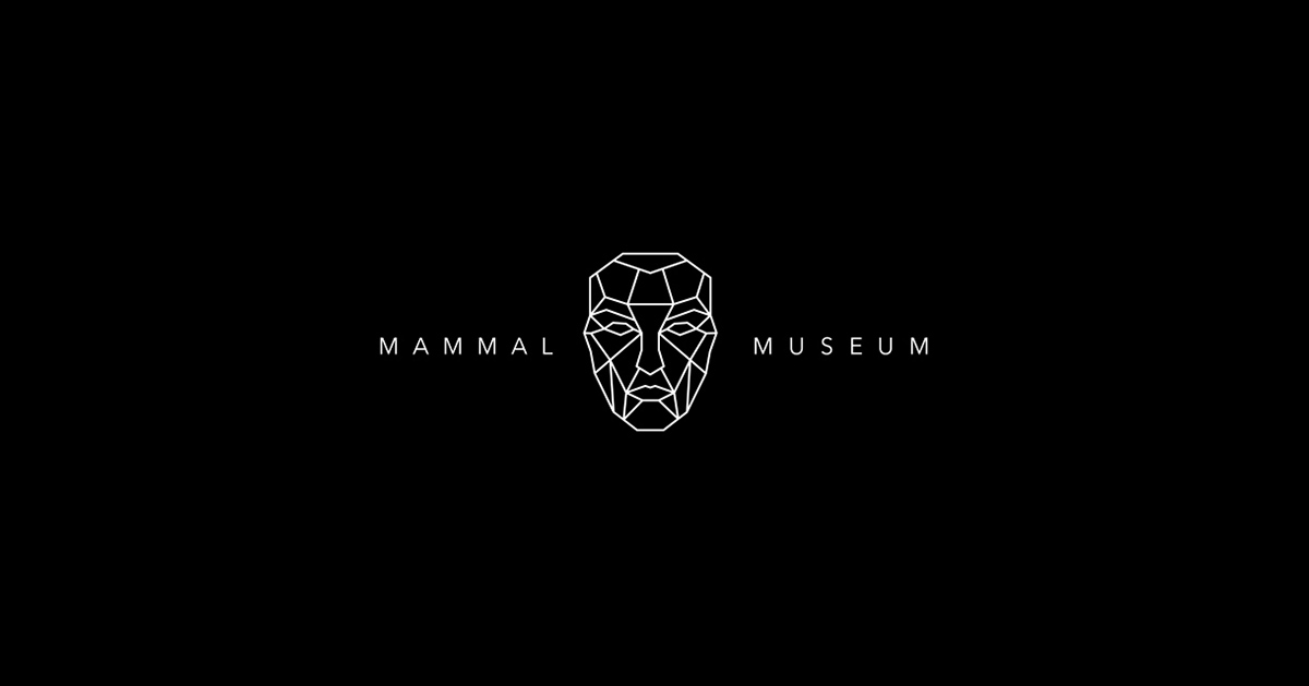
This logo is somewhat disturbing but that made it catch my eye above all of the others. It looks like something you would see in a dream.

Monday, March 21, 2016

Poster Project Stance Reflection

1) I believe that my stance was perfectly represented in my poster project. To show the image of the film industry changing as we know it I showed Hollywood as a stage play thats stage was starting to collapse. The pillars that held up the stage fall apart as the colored words that represent film genres start to bend and fall from the stress. 2) My old poster showed Hollywood as a tree thats roots were beginning to rot as the modern film industry died, I could never quite get this image to be properly represented in illustrator so I changed it to the stage play image I have now. I am far more satisfied with my current image than my past one. 3) My first poster left me clueless, I could barely come up with an idea of what to put with the roots and I was left with a gross blank canvas that had nothing to show Thankfully my final poster perfectly captured my stance and had a decent apperance as well The changes I made for the final poster were very drastic and driven by the fact that actually seeing the layout of my root idea told me how awful it was. The stage play change allowed me to show my stance very well. 4) I feel my strongest category was my design, I created an image that is somewhat memorable and the variety of text and color made me very happy with the final appearance of the piece. My worst category was the concept, I liked my idea of showing a change in the film industry but it took a very long time before I was confident that my design worked well with my concept. 5) Conceptually finding a design that fit my stance was extremely hard due to just how heavily my original work was criticized, I started to doubt if it was a good idea at all. 6) Technically, using illustrator drove me insane and I absolutely hated trying to deal with the programs nonsense.

Wednesday, January 13, 2016

Stance 1

An issue I often see on social media that I would like to discuss is gun violence. I have the belief that guns themselves are not a source of the issue, a gun can only do as much as its owner wants, a gun is a tool. The high amount of non gun related murders is proof that the weapon itself can only go so far. The issue we have with many mass shootings stems from the very violent society we live in, no I am not talking about the media we consume that may be violent, but the fact that we have alot of issues regarding how the country raises its children, there is a lack of moral teaching leaving many Americans confused about what their belief's really are. We also need to stop giving the sick people who commit mass shootings attention, its one of the main reasons awful crimes like this are committed, mourn the victims not the discuss the killers.